How did we Use Conventions?
To make a successful music video we had to stick to some of the major conventions of a music video that we researched before we began.
Firstly the main convention we stuck to was containing elements of both narrative and performance throughout the video, this allows the audience to easily identify the artist but also get drawn into the story of the video; thus giving the video its USP.

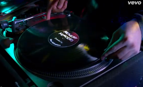
We started the video by showing the artists name and name of the song on screen, again this is a very modern convention which has been used by many large artists including, Miley Cyrus, Tom Odell and One Direction. Again this a way of creating a link between the video and the artist.
We stuck to conventions by using a variety of different camera shots and angles, this linked with our narrative made our music video flow better and allowed it be understood more easily by the audience. We learnt through our research that modern music videos needed to be easy to understand by a large audience, compared to postmodern music videos.
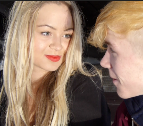
Using our research into narrative theory and various theorists we decided to use some of their theories into our music video. Most noticeably Todorov's theory. Todorov suggested that at the start of a narrative text there was an equilibrium (The star with his girlfriend) then a disequilibrium (Him breaking up with his girlfriend) then a new equilibrium in the end (Him with his new girlfriend.) We achieved this by using a combination of various reaction shots and various shots which express our narrative.
http://storybird.com/books/use-of-semiotics/?token=yxt8smbge3
How did we Challenge Conventions?
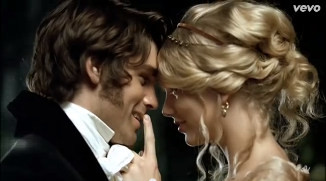
Firstly we planned to include normal looking people as the actors for my video. Conventionally the actors in music videos are typically are extremely attractive people, this is often used as a USP for the video, for example most popular rap videos, and some of our genre, like the male character in Taylor Swifts, Love Story.
To boost the effect that we decided to include we also decided to let our actors wear only minimal and neutral make-up throughout the video, except for "the new girlfriend." the idea behind her make-up came from the idea that society would view her greater because of the fact she had quite clearly made an effort, showing she would be more committed to Daniel in their new relationship, responses to our video show that viewers feel like he is more suited to the new girl, compared to his ex in the video.
 Another convention we challenged for music videos of our genre is the amount of shot locations we used. Most videos of an indie acoustic genre have quite a small Mise en scene, for example only a few like Tom Odell's Another Love or even just have one main location like Jake Bugg's Broken or Asaf Avidan's Reckoning Song. The large amount of Shot locations allowed us to positively express our narrative and was overall successful.
In many ways our music video greatly challenges conventions, these examples were all intentional and were planned during our initial ideas stage of planning.
The next thing we used to push challenge conventions for our video is by contrasting the feelings you got from the colours used with the feelings with the feelings of the character. For example even though you could see the pain of the character throughout the video through the use of narrative the bright colours shown throughout give you an almost sense of hope for the character, it also shows that life's always bright no matter how dark it seems. This makes it a socially relevant with the growing rate of depression in teenagers in modern society.
2. How effective is the combination of your main product and ancillary tasks?
http://www.slideboom.com/presentations/933290/Synergy-Evaluation---Conor-Drury?pk=33e8-e949-07e4-c486-370f-5798-f6d8-7c2c
http://prezi.com/bkplo_frsgkh/combining-the-two/
3. What have you learned from your Audience feedback?
We conducted a small group of media students who watched our music video and then we filmed their reactions. The audience consisted of a variety of different people who each have different genre preferences and who some of wouldn't specifically favour our genre. We conducted this test to see if our music video could be enjoyed by a passive audience
http://www.youtube.com/watch?v=Pq_1s_4H-HU&feature=youtu.be
Using my Polldaddy survey we have been able to collect some audience feedback to see what my target audience thought of the music video, if they enjoyed it and what they might change if they could.
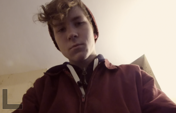
We asked if the audience liked the way we presented the artist and how they might change this if they didn't. The response which we thought was helpful was that the artist looks different throughout the video and that a more consistent appearance would be an improvement. We fully agree with this comment as when we have looked back through the video there are several different outfits used, although some were to represent a change in time the change isn't dramatic enough for this to be clear.


Another response was that the audience wanted the artist to look more passionate about the song and the story behind it.
In response to the question on locations some said they would prefer there to be less filming indoors as the bedroom wasn't extremely realistic for a male teenagers bedroom and that the locations should be made to look more meaningful- for example, more flashbacks of him there with his 'ex' to show the locations have meaning to him.
The costume was described as suitable for the story and it matched the teenagers character, the clothes are up to date and fashionable.
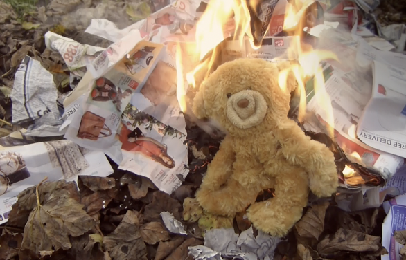
We asked what the audience disliked about the video, the main response we collected what that they didn't like to see the teddy being burned but we think this portrayed the feeling of sadness in the video, one of the responses commented on the shaky filming, although they said they disliked this it was an intentional filming technique, we used it on the shot of the fire at the bridge of the song, the music and singing sounds raw and so we think the video matches the music well.
We asked what the audience disliked about the video, the main response we collected what that they didn't like to see the teddy being burned but we think this portrayed the feeling of sadness in the video, one of the responses commented on the shaky filming, although they said they disliked this it was an intentional filming technique, we used it on the shot of the fire at the bridge of the song, the music and singing sounds raw and so we think the video matches the music well.
Finally we asked what my audience liked about the video, many of the responses were that they enjoyed watching the video because it told a story with or without the music, another comment was on the editing technique, they thought the editing was good in the video, although we didn't use a lot of filters or transitions the simple editing has proved to be quite successful.
4. How did you use media technologies in the construction and research, planning and evaluation stages?
We used a variety of different Media technologies during the construction phase of our music video, probably the most in this phase compared to the rest of them.
The main digital technologies we used was obviously a combination of film and Final Cut Pro. We filmed using a canon dslr camera which gave us a good quality picture as well as saved the film as a format we could directly upload onto Final Cut Pro.
Final Cut Pro allowed me to easily manipulate the clips we had filmed and turn them into the final video. The benefit of using software like this was that we could see each separate clip at the same time on the screen. Something that we managed to perfect on my own was timing of each clip. To do this we used a series of placeholders which corresponded to the length of each shot and timing of the song.
As well as using this software we also used various others. Such as google chrome, this allowed us to update the blog we shared as well as communicate with each other for free using stoical networking sites like Facebook. We also used sites such as YouTube to release drafts of our music video and to also watch guides if we ever didn't know how to do anything of Final Cut Pro.


